Redegal, Google Partner Premier agency 2025
Heatmaps are a key tool that you need to know and start applying in order to offer the best user experience within the digital environment. Want to know more about heatmaps and the benefits they can bring to your website? We’ll tell you about it!

The website speaks of the brand by itself, it is a reflection of what the brand is and what the user perceives of it. Throughout the day the website is filled with hundreds or thousands of visits, a traffic quite complicated to control and to bring to our own field. For this, it is necessary to have tools such as heat maps, a resource that allows us to know more about the user, to know what he likes and what he spends more time on, without forgetting that the user experience within the online environment is primordial.
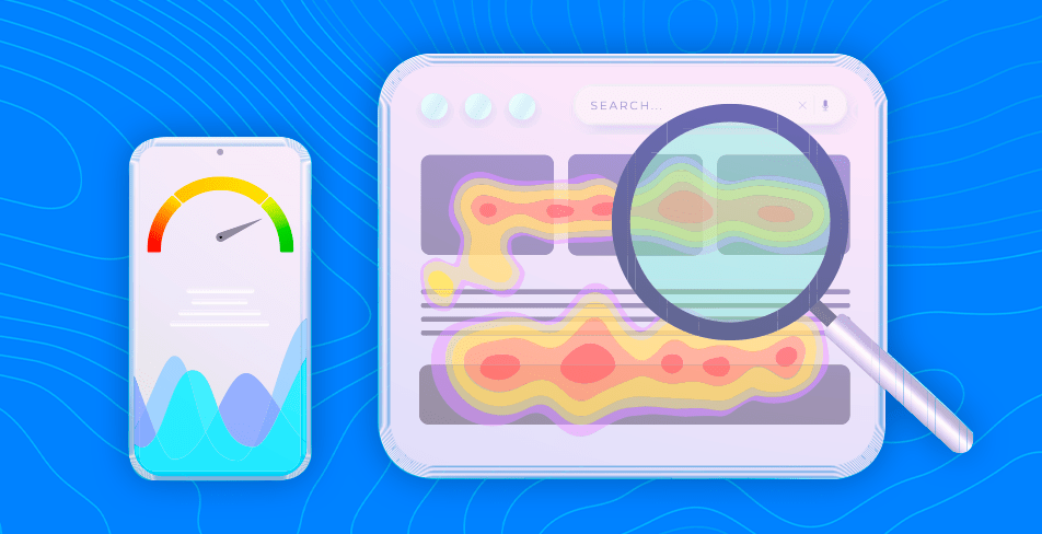
It is a graphical representation in which different colors are used to indicate the different parts of the web page where users make more interactions, the sites where the surfer clicks, the parts that are read and those that are passed over… It is a way to monitor user activity with the aim of offering a better experience in the digital environment since in this way statistical data is obtained that allows to improve the website by making it more easily navigable.
There are different types of heat maps or heatmaps depending on the specific needs to be met. Each map is different and the choice between one or the other depends on the information to be obtained. Among the most commonly used are:
These are some of the objectives and benefits of using heat maps for your website:
These maps use a standardized color scheme. The areas with the fewest visits (the so-called cold ones) are marked with green or blue, while the hottest ones can be represented with red, orange or yellow.
The most important thing about these maps is to apply them for a certain period of time, since in this way relevant data can be obtained to create statistics that provide value and improve the user’s experience on the website. Among the tools used to generate them are:
Heat maps are very useful to detect those points of improvement on your website, they provide relevant information, especially for ecommerce, they play a fundamental role in the continuous improvement of a website in terms of increasing conversion rates, usability and a better user experience.
However, heat maps should be analyzed in conjunction with other analytical data. In this way, it will be possible to get an overall view of the interaction on the page and to find out whether the content being produced really attracts users or needs to be modified.
Would you like to apply heat maps and make improvements for the user? Our Digital Analytics and Web Development teams will be happy to help you, do not hesitate to contact us 🙂
You may be interested in our latest posts

Redegal, Google Partner Premier agency 2025

Bluesky: What is it and how to create an effective strategy

The Super Bowl in a data-driven era

Corporate image of a company: What is it and its key elements
Discover the best digital strategies for your brand
Hi!
We are looking forward to hearing more about your digital business.
Tell us... What do you need?
Fill in the form or call us at (+44) 2037691249