Redegal, Google Partner Premier agency 2026
RDG 6.60 €
Landing pages are one of the most powerful tools in digital marketing. In this post we give you a series of tips to optimize them and make a difference.

6 hours and 37 minutes is the average time a person spends on the internet daily, according to a study by DataReporter. Therefore, it is increasingly difficult to capture the user’s attention, keep them on a website, and collect their information to convert them into a lead for your brand. A simple, clear, and dynamic landing page can be the opportunity to connect with your target. That’s why a landing page should be integrated into your business marketing strategy.
If you want to get the most out of your landing pages, don’t worry! In this post, we provide a series of tips to optimize them and start achieving your goals. Ready? Keep reading and find out!
Landing pages are web pages hosted on a website with the goal of generating the highest number of conversions. Their purpose is to turn user visits into leads or subscribers and to get them to complete specific actions. These actions will vary depending on the goals defined by your brand.
For example, they can be aimed at acquiring customers for the sale of a product, hiring a service, signing up for a webinar or a newsletter. Additionally, they can serve as a mechanism to gain new subscribers to target with an SMS marketing campaign.
In this way, landing pages are one of the most powerful tools in digital marketing.
What should a landing page have to convert? Here are some of the points to keep in mind to optimize your landing page.
If the design is attractive, users are more likely to spend more time on the website and increase their interaction. Therefore, it is important to pay attention to the design and build the landing page with the users’ preferences and interests in mind. After all, they are the ones who need to access and decide whether to stay on the website. Here are some tips to apply in the design of your landing page:
The headline is one of the most important elements of the landing page. If the user sees it and it draws their attention thy’ll probably decide to continue reading more information.
To achieve this, think of a creative and short title. Use a font that stands out, larger than the rest of the text that appears on the page. Although not too much, since visual balance is important.
It’s advisable to use subtitles and bold text to highlight different sections or product features. Moreover, if you’re interested in letting your landing page rank on search engines, make sure to use appropriate keywords and emphasize the headline with an H1 tag, and the main subtitles with H2 tags. In Redegal, we can assist you with your brand’s SEO because we have a team of professionals who are experts in this field.
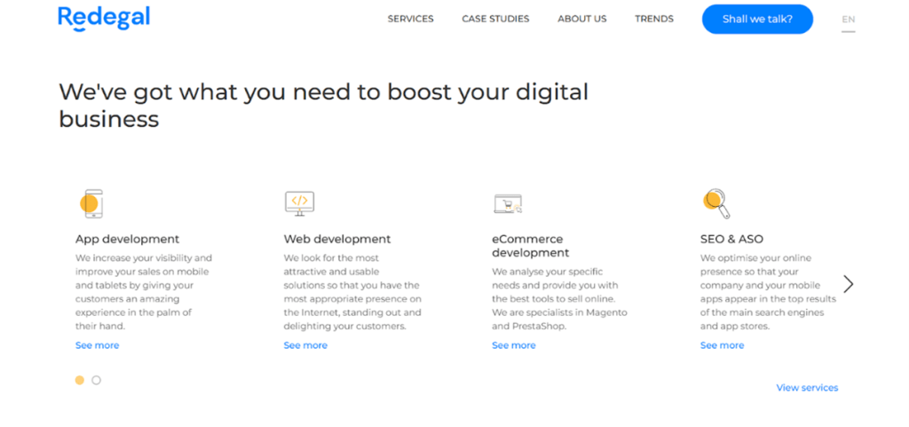
On the website of our global full digital company you can find an example of a headline that captures the audience. In just a dozen words is defined the line of work and services that users can find.
Don’t expect to get customers without offering them anything in return. Most users will not be willing to give up their personal data, specially if it is a company they do not know.
If your goal is to sell a product, it’s essential to use this space to highlight the benefits it will bring to the user. It’s not just about listing the features and specifications of the product. You need to convince the user why your product will add value to their daily life.
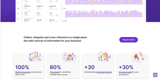
For example, at Redegal, we offer Binnacle Data, a data-driven tool to monitor your ecommerce data. On its landing page, we address why you should use this service and showcase quantitative data illustrating the benefits gained from its use.
The call to action or CTA is the button that invites the user to click to achieve a specific goal (a purchase, subscription, offer, etc). This element is essential on a landing page and we must pay special attention to its design, as the conversion rate largely depends on it. CTA should be visible, impactful and concise. As a recommendation:
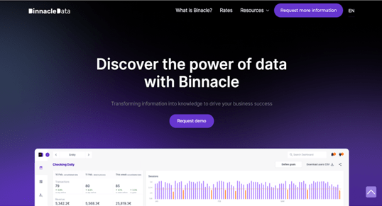
Again, we exemplify this essential element on landing pages for achieving conversion through the Binnacle Data tool. On the first visible screen of its website, there is a CTA button to request a demo and in the navigation menu, another one is available to request more information.
If you also include positive reviews from people who have tried your product, you will reinforce your message. This type of content provides significant credibility and helps humanize the brand. For services, it’s beneficial to add relevant data for users, such as logos of clients who use it.
If one of the objectives of your landing page is to receive organic traffic, it’s not enough for the content and design of the landing page to be attractive. It’s also necessary for all elements to be properly optimized for SEO positioning.
Before creating the page content, you should conduct keyword research to identify which terms will help position your landing page. Then, choose the primary and secondary keywords that best fit your needs. Pay attention to other elements as well:
Several studies have shown that landing pages containing explanatory videos have up to a 50% higher chance of appearing on the first page of Google. It’s advisable to use them, especially when introducing a new company or product to the market, as videos help users quickly and easily understand how it works.
Moreover, it’s the perfect resource for expressing an idea and spreading it through social networks. Among the characteristics this video can have are that it should not exceed one minute in duration, be positioned prominently on landing pages, and be of high quality yet easy to process.
Forms should be as brief as possible. Often, registrations are lost because users feel it’s intrusive when companies request too much personal information right from the start. To avoid this, only ask for the minimum number of fields necessary to handle the contact or information request effectively. For example, fields like name, surname, phone number, email address, and necessary company information, as seen on our full digital agency’s website.
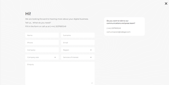
In an ecommerce strategy you may need to request more information to segment your content strategy. The ideal is to ask the user for this data gradually and always offering something in return: discounts, promotions, exclusive content…
In a landing page, it’s important to minimize distractions for users and eliminate any elements that could cause them to lose focus and leave the page. It’s advisable to avoid using navigation menus, remove links or buttons that redirect to content outside of the landing page.
Google provides a guide on how to optimize landing pages for conversions. It emphasizes that internet users prefer fast and smooth-functioning websites. Evaluating the loading speed of your landing page and ensuring it meets search engine parameters can help you climb higher in search engine rankings. This translates to increased visibility and conversion opportunities for your brand.
Access to websites now happens from various devices such as computers, tablets or smartphones. Therefore, it’s crucial to be prepared and optimize the landing page to be visible on all of them. Before launching, it’s recommended to thoroughly review everything to ensure it’s correct.
Are you looking to create a landing page? We offer web development and design services that will help bring your vision for your brand to life. Shall we talk?
You may be interested in our latest posts

Redegal, Google Partner Premier agency 2026

Working with Digital Teams: Why the Future of Software Is Not Hiring Developers, but Integrating High-Performance Assets
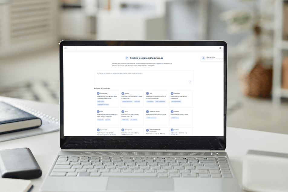
Intelligent Dynamic Feeds: how to analyse your catalogue with AI in seconds using Boostic.cloud
Follow Google’s Universal Commerce Protocol (UCP) to increase your sales
Discover the best digital strategies for your brand
Hi!
We are looking forward to hearing more about your digital business.
Tell us... What do you need?
Fill in the form or call us at (+44) 2037691249